Procreate Handbook
Sorry. We’re having trouble copying to your clipboard.
Try directly copying the link below.
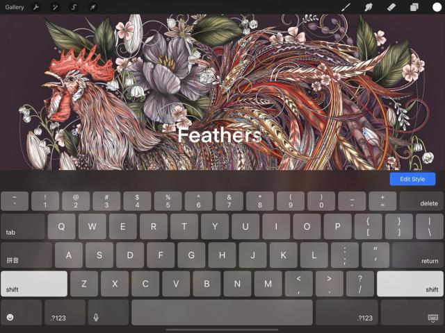
Edit Style
Preview fonts in real-time, adjust kerning, tracking, baseline and other typography settings with a series of intuitive sliders, and control alignment and other visual attributes.
Edit Style Panel
A clean interface puts every text styling tool you need at your fingertips.


When you add new Text to your canvas, the Edit Style panel appears at the bottom of the screen. It offers a range of options for the appearance and behavior of your vector text.
The Edit Style panel will close when you tap off your text or start making edits to other layers.
Reopen the Edit Style panel at any time by selecting the Text layer as your primary layer in the Layers panel and:
Tap on the Text displayed on your canvas.
Tap on the Text layer in the Layers panel once more to bring up Layer Options, and tap Edit Text.
The Edit Style panel gives you control over four aspects of your Text: Font, Style, Design, and Attributes.
Select the typeface for your text.
Scroll through the Font list to browse all your installed typefaces.
The name of each font is a preview of the appearance of that font.
Tap any font in the list to see it applied to your Text.
Some fonts offer multiple widths and styles.
Fonts frequently include regular, italic and bold versions, and some include other options like ultralight, thin, and black.
Tap any font in the Font list to see the available variants in the Style section. Tap a style to apply it.
Change size, kerning, tracking, and other font display attributes with slider-based design tools.
The Design section offers six sliders to tweak the following font design attributes:
Size
Adjusts the size of the text within the text box. The text box will retain the same width but will change height to accommodate font size changes.
Kerning
Adjusts the spacing between individual pairs of letters.
Tracking
Adjusts the spacing between every letter in a block of text.
Leading
Adjusts the spacing between each line of text in a block of text.
Baseline
Adjusts the position of the invisible line on which your text sits within the text box.
Opacity
Adjusts the transparency of the text.
Change the alignment of your text, add underlines or an outline effect, or toggle capitals.
A series of simple buttons and toggles offer control over miscellaneous alignment and text effects.
Alignment
The top four buttons set paragraph alignment for your text. The four alignment options are left, center, right, and justified.
Underline / Outline
The middle buttons toggle two simple text effects. Underline adds a stroke underneath your text, and Outline changes a solid font to an outlined version. You can use both effects at once.
Capitalization
The toggle at the bottom changes your text to full capitalization, regardless of how much capitalization it started with. You can toggle this effect off to return to your original capitalization.
Tap Done to apply all changes or Cancel to discard all.
Sorry. We’re having trouble copying to your clipboard.
Try directly copying the link below.
Still have questions?
If you didn't find what you're looking for, explore our video resources on YouTube or contact us directly. We’re always happy to help.
