Procreate Handbook
Sorry. We’re having trouble copying to your clipboard.
Try directly copying the link below.
Color Adjustments
Take your art to the next level with industry-standard color adjustment tools. Adjust Hue, Saturation and Brightness or expertly tweak your Color Balance. Experiment with Curves over a helpful histogram, and Recolor parts of your image with ease.
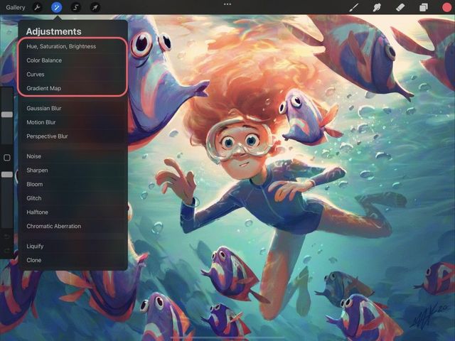
Hue, Saturation, Brightness
Tweak the color value, vibrancy and lightness of any layer with simple sliders.
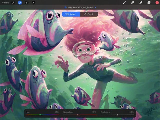
HSB is the simplest way to make quick color adjustments.
Tap Adjustments > Hue, Saturation, Brightness to enter the HSB interface.
Interface
Three sliders give you control over the general quality of color in your image.
Hue determines the overall color tone used in the image. This slider is a spectrum of all available shades of color.
Saturation determines color strength. Move the slider left to desaturate the color down towards gray, and right to make the color as vibrant as possible.
Brightness sets the overall lightness or darkness of the image.
Commit Changes
Commit all changes with one touch.
To commit your changes and leave Adjustments, Tap the Adjustments icon again.
To commit to changes and stay in Hue, Saturation & Brightness, Tap the canvas to invoke Adjustment Actions and Tap Apply.
Color Balance
Correct or stylize your color scheme by changing the balance of hues that make up your artwork.
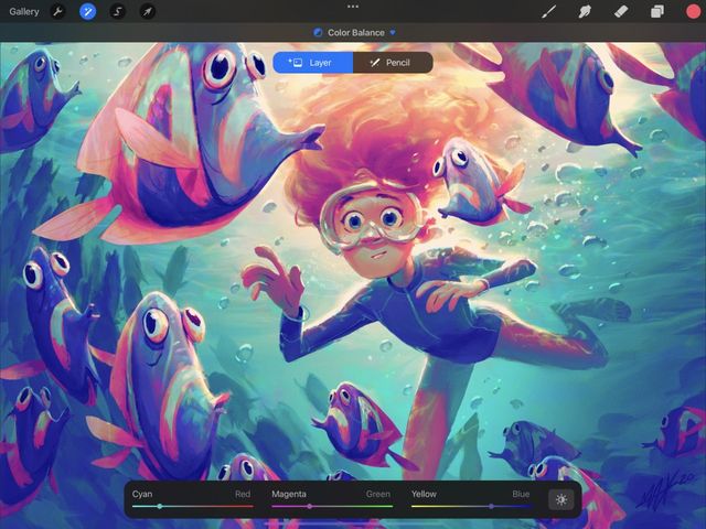
Colors formed on-screen consist of a mixture of three primaries: red, green, and blue. Combining these three values in different ways allows for over sixteen million unique shades of color.
Changing the mixture of RGB with Color Balance gives you the power to make quick color corrections on your image. Or you push the RGB colors to the limit to create stylization.
Tap Adjustments > Color Balance to enter the Color Balance interface.
Interface
Use RGB sliders and Highlights / Midtones / Shadows buttons to tweak the colors of your active layer.
Color Balance splits Red, Green, and Blue into their own sliders. Each of these colors are balanced with its opposite (Cyan, Magenta, and Yellow).
This also splits the Highlights, Midtones, and Shadows of your image into three sections. This is so you can more finely control which parts of your image are affected by your color changes.
Sliders
Slide to the right to move the tone of your layer towards Red, Green, or Blue. Slide to the left to shift towards Cyan, Magenta, or Yellow.
Buttons
Tap Shadows, Midtones, or Highlights to choose which part of your image will be affected by your color changes. This will affect the darkest parts, middle tones, or brightest areas of your image.
Pro Tip
Adjusting the Midtones is the best way to achieve even color adjustment. Midtones are selected by default when you open Color Balance.
Commit Changes
Commit all changes with one touch.
To commit your changes and leave Adjustments, Tap the Adjustments icon again.
To commit to changes and stay in Color Balance, Tap the canvas to invoke Adjustment Actions and Tap Apply.
Curves
Modify your layer’s color and tonal balance in one smooth motion using powerful Curves.
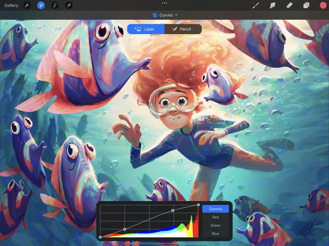
Curves offer by far the most advanced way to adjust color and contrast in your image.
Tap Adjustments > Curves to enter the Curves interface.
Overview
This tool represents the tonal values of your layer as a straight line on a graph. You can bend this line into curves that affect the colors of your image in a variety of ways.
The colored part of this graph is called a histogram. It’s a map of where each color appears in your image, and how much of it there is. It can help you visualize how your changes will affect the overall color balance of your layer.
Interface
Nodes
Drag a node up to affect the lightness of your layer. Drag a node down to affect the darkness. Drag a node left or right to affect contrast.
You can add up to 11 nodes. To remove a node, tap it, then tap Delete.
The best way to understand how curves work is to experiment with them and watch how your layer changes.
Histogram
The histogram is a graphical representation of the balance of red, green, and blue color in your image. Colors other than red, green, and blue indicate these channels are overlapping. For example, purple means that blue and red are both present in that part of the image. While white means all three channels are active.
Gamma and Channels
By default, when you start using curves you’re changing the overall gamma, which means you are adjusting all three color channels - red, green, and blue - at the same time.
Tap Red, Green, or Blue to start adjusting a color channel in isolation. Adjusting curves on individual color channels allows practically limitless control over color corrections and effects.
Commit Changes
Commit all changes with one touch.
To commit your changes and leave Adjustments, Tap the Adjustments icon again.
To commit to changes and stay in Curves, Tap the canvas to invoke Adjustment Actions and Tap Apply.
Gradient Map
Apply a colorful gradient across your images using a Gradient Map.
Gradient mapping analyses the highlights, midtones and shadows of an image. It then replaces (maps) these with the colors found in a new gradient.
Tap Adjustments > Gradient Map to enter the Gradient Map interface.
Interface
Use preset Gradient Palettes to assign a Gradient Map to your image. Or build your own custom Gradient Palette to create impactful images.
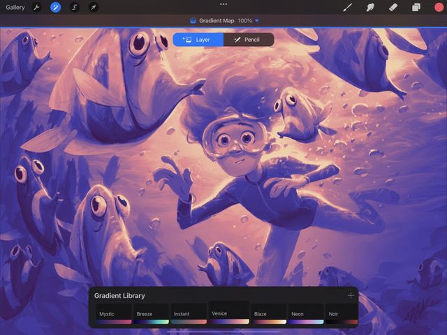
Gradient Library
The Gradient Library contains eight preset Gradient Palettes assignable to your image — Mystic, Breeze, Instant, Venice, Blaze, Neon, Noir and Mocha. Tap a Gradient Palette to assign it to your image. Or slide the Gradient Palettes left or right to view the various preset Gradient Maps cycle through your image.
Touch and Hold a preset Gradient Pallet to Delete or Duplicate it. Touch, Hold and Drag a preset Gradient Pallet to reorder it in your Gradient Library. To restore your Gradient Library’s default gradients, Touch and Hold the + symbol at the top of your Gradient Library panel. Then Tap the Restore defaults button.
Create a custom Gradient
To create a custom-made gradient palette, Tap the + in the top right hand corner of the Gradient Library, or Tap an already selected Gradient to edit it.
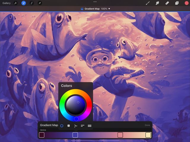
Gradient Map
When creating or editing the Gradient Library, the interface will change to the Gradient Map interface. Here you will see a gradient with at least two points of color. The left-hand side of the Gradient Map affect the shadows and darker tones of your image. The right-hand side will affect the highlights and brighter tones of your image.
Tap a Color Point to bring up the color picker and change the color of that point.
To add a Color Point to your Gradient Map, Tap anywhere along the gradient where there isn’t an existing swatch. A Gradient Map must have at least two different Color Points at either end of the gradient. However, you can add an extra 10 Color Points along the gradient for a total of 12 colors.
Touch and Hold a Color Point to delete it from you Gradient Map.
Tap a Gradient Map's Title to name or rename it. Tap Done when you are ready to save a Gradient Map to your Gradient Library.
Commit Changes
Commit all changes with one touch.
To commit your changes and leave Adjustments, Tap the Adjustments icon again.
To commit to changes and stay in Gradient Map, Tap the canvas to invoke Adjustment Actions and Tap Apply.
Sorry. We’re having trouble copying to your clipboard.
Try directly copying the link below.
Still have questions?
If you didn't find what you're looking for, explore our video resources on YouTube or contact us directly. We’re always happy to help.