Procreate Handbook
Sorry. We’re having trouble copying to your clipboard.
Try directly copying the link below.
Harmony
Supercharge your art with the power of color theory. Harmony builds instant color schemes based on your color choices. These can be Complementary, Split Complementary, Analogous, Triadic, or Tetradic.
Choose a Color Scheme
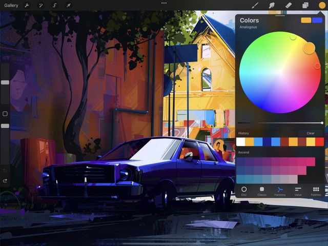
On the right-hand side of the top menu, you’ll see the Active Color. Tap to open the Color panel, then tap the Harmony tab. Procreate will remember your preference in future.
The Harmony interface combines Hue and Saturation into a single color wheel.
Colors on the edge of the wheel are at maximum saturation. These colors become less saturated toward the middle of the wheel.
Adjust Brightness by dragging the black and white slider under the wheel.
Reticles
The color wheel contains a reticle: a clear circle you can drag around to select a color.


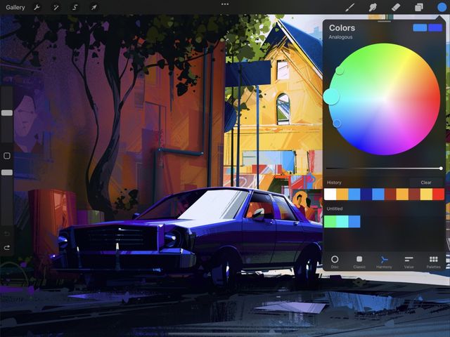
The Harmony color wheel contains one or more secondary reticles depending on the active Harmony mode selected, in addition to the primary reticle . The secondary reticles shift position based on where you move the primary reticle in the selected Harmony mode to display your choice of harmonious colors.
The amount of secondary reticles changes based on the active Harmony mode.
Modes
Choose from five different modes. These select harmonious color schemes from the wheel, based on classic color theory.
At the top left of the Harmony interface, you’ll see the word Complementary. This is the default Harmony mode. Tap on Complementary to see the full list of five different Color Harmony modes.
Two reticles select colors from opposite positions on the color wheel.
Because they are exact opposites, complementaries can make each other appear brighter. One will always be a cool color, and the other will always be warm. Together, they create the highest possible contrast on the color wheel. They can also mix to create effective neutral hues, or they can blend together for shadows.
Three reticles select colors in a sharp triangle formation.
Split complementary schemes use a base color and two secondary colors placed symmetrically on the color wheel. In split complementary the three reticles position to form a narrow triangle. This gives you a combination of one warm and two cool colors, or vice versa. Unlike the complementary color, split complementary schemes are often more balanced and easier on the eyes. Generally the color at the ‘sharp’ end of the triangle is the main shade. The two secondary colors work as highlight and accent colors.
Three reticles select neighboring colors from one area of the color wheel.
This scheme uses one base color and two secondary colors, like Split Complementary. As above, the base color is best used as the main shade in the artwork. The secondaries are reserved for highlights and accents. Because the three shades of analogous color are positioned so close together, the result is uniformly warm or cold. This creates an elegant and clear color scheme without any tension in the palette.
Three reticles select colors in an equilateral triangle formation.
This variant of the split complementary color scheme puts equal distance between all three colors. The result is a trio of colors that are equally dominant. This makes for a vibrant and punchy result which should be carefully balanced in artwork.
Four reticles select colors in a square formation. These colors will be from opposite corners of the color wheel.
Like the Triadic scheme, the tetrad places equal distance between all the colors chosen. This results in no clear dominance of one color over another. The results are vibrant and colorful. These shades can be aggressive in combination. Careful planning and a sensitive approach work to get the best visual outcome.
Selecting Colors
Select each color in your scheme so you can begin painting or build up a harmonious palette.


Tap any reticle to select the color within it to immediately paint with that color. Tap and drop the colors Harmony has selected for you into a palette one by one to create a color scheme.
Finishing Up
The rectangles in the top right of the Color Panel display your primary and secondary colors.
Tap anywhere outside the Color Panel to close it once you’re happy with your chosen color.
Sorry. We’re having trouble copying to your clipboard.
Try directly copying the link below.
Still have questions?
If you didn't find what you're looking for, explore our video resources on YouTube or contact us directly. We’re always happy to help.

