Procreate Handbook
Sorry. We’re having trouble copying to your clipboard.
Try directly copying the link below.
Blend Modes
By default, content on a layer is opaque and covers up the contents of layers underneath it. But there are others ways the objects and colors on two layers can interact and blend. Blend Modes open up all kinds of interesting visual possibilities.
Interface
A scrolling list of Blend Modes gives you the freedom to preview all your options in a snap.
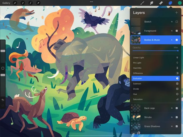
First, open the Layers Panel by tapping the double rectangle symbol in the top right of Procreate's interface.
On the right hand side of each layer, you'll see one or more letters. These tell you which Blend Mode is active on your layer.
By default, Normal mode is active, shown by the letter 'N'.
Tap it to open the Blend Modes menu.
The Blend Modes menu has two parts. The name of the current Blend Mode, and the Opacity slider.
Tapping the name gives you a scrolling list of Blend Modes to choose from. As you scroll, each Blend Mode will apply to your layer so you can preview the results.
When you find one you like, tap anywhere outside the list to close it.
Opacity controls how transparent a layer is.
In Normal mode, full opacity means solid objects on your layer completely block objects on the layer below. In other Blend Modes opacity can affect visual elements like color intensity or darkness.
To adjust opacity, move the slider left to make your layer more transparent. Slide it to the right to make the layer more solid.
This will alter the opacity of the entire layer, ignoring any current selection. Learn how to adjust opacity on only the selected parts of a layer in Interface and Gestures .
Pro Tip
As a shortcut, you can adjust layer opacity by two-finger-tapping a layer. A narrow blue bar will appear at the top of your canvas. Slide your finger to the left on the canvas to make your layer more transparent. Slide to the right to make it more solid.
Blend Mode Types
Explore the many ways you can mix layers together visually.


Multiply
This mode multiplies the luminosity of the base color by the blend color. The result is an overall darker and more intense effect. Multiply produces different levels of darkening depending on the luminosity of the blend layer. Multiply is perfect for darkening images or creating shadows.
Darken
This mode does not blend pixels, but compares the base and blend colors, and keeps the darker of the two. If the blend layer and the base layer color are the same, Darken makes no change.
Color Burn
Color Burn is a mode designed to mimic the use of the burn tool used to darken images in traditional photography. It increases the contrast between the base and blend colors. This results in higher mid-tone saturation and reduced highlights. Color Burn usually produces a darker result than Multiply.
Linear Burn
Linear Burn decreases the brightness of the base color based on the value of the blend color. This gives a result that is darker than Multiply but less saturated than Color Burn. It produces more contrast in darker colors than other Blend Modes.
Darker Color
Darker Color functions some what like Darken. Instead of looking at each RGB channel individually, Darker Color takes a composite of all the RGB channels.
Lighten
This mode does not blend pixels, but compares the base and blend colors, and keeps the brightest of the two. If the blend and base colors are the same, Lighten makes no change.
Screen
Screen produces different levels of brightening depending on the luminosity values of the blend layer. This makes it an ideal Blending Mode for brightening images or creating highlights.
Color Dodge
Color Dodge is based on the dodge tool used to brighten images in traditional photography. It creates a brighter effect than Screen by decreasing the contrast between base and blend colors. This results in saturated mid-tones and blown-out highlights.
Add
Much like Screen or Color Dodge, Add will produce an even stronger result. It looks at the color information in each channel and brightens the base color. Add does this to reflect the blend color by increasing the brightness.
Lighter Color
Lighter Color functions like Lighten. Rather than looking at each RGB channel individually, Lighter Color takes a composite of all the RGB channels.
Overlay
Overlay works like a combination of Multiply and Screen. It both lightens and darkens images by shifting the mid-tones. Dark blend colors shift the mid-tones to darker colors. Light tones shift the mid-tones to brighter colors.
Soft Light
Soft Light is like a gentler version of Overlay. It applies subtle darkening or lightening effects based on luminance values. This achieves a similar result to Overlay minus the harsh contrast.
Hard Light
Hard Light is a combination of Multiply and Screen. It uses the brightness values of the Blend layer to make its calculations. Results with Hard Light tend to be more intense. As with all Blend Modes, reducing the layer’s opacity will soften the result.
Vivid Light
Vivid Light is an extreme version of Overlay and Soft Light. Anything darker than 50% gray is darkened. Anything lighter than 50% gray is lightened. Like Hard Light, it can produce very strong results, and may work best with reduced opacity.
Linear Light
Another Blend Mode that produces very strong results. Linear Light combines Dodge effects on lighter pixels with Burn effects on darker pixels. Its results may also work better with a little reduced opacity.
Pin Light
An extreme Blend Mode, Pin Light performs Darken and Lighten simultaneously. This creates a patchy result with all mid-tones removed.
Hard Mix
Hard Mix is an extreme Blend Mode that flattens detail. It creates a super-flat, super-saturated result that almost looks posterized. Hard Mix provides a result using only white, black, and any of the six primary colors - red, green, blue, cyan, magenta, or yellow. Opacity adjustments can soften the result.
Difference
As the name suggests, Difference uses the difference of the base and blend colors to create the resulting blend. White pixels invert the colors of the base layer. Black pixels produce no change. while dark grays apply slight darkening.
Exclusion
Exclusion works the same way as Difference on blacks and whites, but doesn’t darken grays.
Subtract
Subtract darkens colors in a drastic manner by subtracting brightness. Light areas darken the most, while already dark areas produce little change.
Divide
Divide is the opposite of Subtract. Darker colors create brighter results, while already light areas produce little change.
Hue
Use Hue to change the hues in a layer while maintaining the tones and saturation of the original.
Saturation
The Saturation Blend Mode preserves the luminosity and hue of the base layer. It does this whilst adopting the lowest saturation value of each, for any given pixel.
Color
Color preserves the luminosity of the base layer while adopting the hue and saturation of the blend layer. This makes it ideal for coloring monochromatic images. For example, if creating a fully shaded character portrait in greyscale, use a Color layer over the top to make it to full color.
Luminosity
Luminosity preserves the hue and saturation of the base layer while adopting the luminosity of the blend layer.
Sorry. We’re having trouble copying to your clipboard.
Try directly copying the link below.
Still have questions?
If you didn't find what you're looking for, explore our video resources on YouTube or contact us directly. We’re always happy to help.
