Procreate ハンドブック
クリップボードにコピーができませんでした。
以下のリンクをコピーしてみてください。
Harmony
Supercharge your art with the power of color theory. Harmony builds instant Complementary, Split Complementary, Analogous, Triadic, and Tetradic color schemes based on your color choices.
Choose a Color Scheme
On the right hand side of the top menu, you’ll see the Color button. Tap it to open the Color panel, then tap the Harmony tab. Procreate will remember your preference in future.
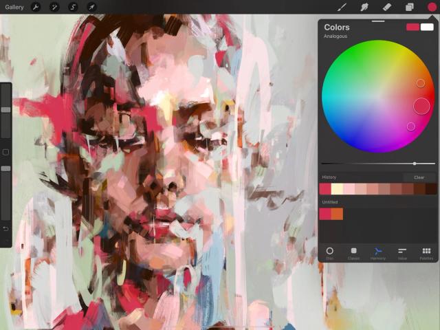
The Harmony interface combines Hue and Saturation into a single color wheel.
Colors on the edge of the wheel are at maximum saturation, and become less saturated toward the middle of the wheel.
Adjust Brightness by dragging the black and white slider under the wheel.


Reticles
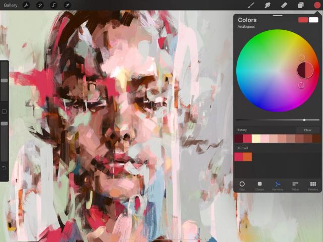
The color wheel contains a reticle: a clear circle you can drag around to select a color.
As you drag the reticle, it displays two colors. On the right side you’ll see the color the reticle hovers over. On the left, you’ll see the most recent color in your History. This allows you to compare your new color choice with the shade you’ve just used in your painting.
The Harmony color wheel also contains one or more secondary reticles that change position automatically based on where you move the primary reticle.
The number of secondary reticles changes based on the active Harmony mode.
Modes
Choose from five different modes that automatically select harmonious color schemes from the wheel, based on classic color theory.
At the top left of the Harmony interface, you’ll see the word Complementary. This is the default Harmony mode. Tap on Complementary to see the full list of five Color Harmony modes.
Two reticles select colors from opposite positions on the color wheel.
Because they are exact opposites, complementaries can make each other appear brighter. One will always be a cool color, and the other will always be warm. Together, they create the highest possible contrast on the color wheel. They can also be mixed to create effective neutral hues, or they can be blended together for shadows.
Three reticles select colors in a sharp triangle formation.
Split complementary color schemes use one base color and two secondary colors placed symmetrically on the color wheel, positioned in a narrow triangle. This will give you a combination of one warm and two cool colors, or vice versa. Unlike the complementary color scheme above, a split complementary scheme is often more balanced and easier on the eyes. Generally the color at the ‘sharp’ end of the triangle is the main shade used, with the two secondary colors used as highlights and accents.
Three reticles select neighboring colors from one area of the color wheel.
This scheme uses one base color and two secondary colors, like Split Complementary. As above, the base color is best used as the main shade in the artwork, with the secondaries reserved for highlights and accents. However, because the three shades of analogous color are positioned so close together, the result is uniformly warm or cold, creating an elegant and clear color scheme without any tension in the palette.
Three reticles select colors in an equilateral triangle formation.
This variant of the split complementary color scheme puts equal distance between all three colors. The result is a trio of colors that are equally dominant. This makes for a vibrant and punchy result which should be carefully balanced in artwork.
Four reticles select colors in a square formation from opposite corners of the color wheel.
Like the Triadic scheme, the tetrad places equal distance between all the colors chosen, resulting in no clear dominance of one color. The result is vibrant and colourful. These shades can be aggressive in combination, so careful planning and a sensitive approach are needed to get the best visual outcome.


Selecting Colours
Select each color in your color scheme so you can begin painting or build up a harmonious palette.
Tap any reticle to select the color within it. From here you can immediately paint with that color, or tap and drop the colors Harmony has selected for you into a palette one by one to create a color scheme.
Finishing Up
The rectangles in the top right of the Color Panel display your active and secondary colors.
Once you’re happy with your chosen color, tap anywhere outside the Color Panel to close it.
クリップボードにコピーができませんでした。
以下のリンクをコピーしてみてください。
お探しのものが見つかりませんか?
探しているものが見つからない場合は、YouTube動画のリソースを検索するか、直接お問い合わせください。いつでも喜んでお手伝いさせていただきます。

